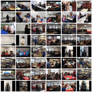
The Kernersville Cares for Kids website was a group project for my class. My contribution was the photo album page. The client preferred having the photos laid out on a grid rather than using a slider or carousel. It was suggested that I have the enlargements open on a separate page. I already knew a different way to display the enlargements so I used it. It was the first time I had arranged photos that way. In this case, the photo files were small enough that I used a single file for each rather than a thumbnail and a large one for each.


